 With digital cameras everywhere today, it is easy to capture vivid color images, yet when you look at photography magazines, books and visit galleries you will still see many B&W images.
Why are B&W images still relevant in our color world? When you remove color from an image, the viewer is forced to focus on the shapes, lines and lighting in the image. This is why many architectural images are shown in B&W, because the photographer wants you to focus on the design of the building and not on the various colors of light reflected onto the facade. Similarly, wedding photographers will show their clients B&W images because the emphasis becomes more about the look on the peoples’ faces, the clean lines of the groom’s suit or the intricate details on the bride’s dress and less on what color the flowers in her bouquet are. Whether taken decades ago or just the other week, B&W images maintain a classic look that will always be in style.
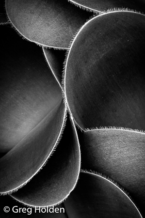
When I am out photographing, I like to look for interesting shadows, textures and patterns that would make great B&W photos. When you start to train your eyes to look past the color of things and instead focus on their shape, you’ll be on your way to “seeing in B&W.” You will discover that subjects that you would normally pass over due to their unpleasing or distracting colors can make an effective B&W image.
Although wide shots are always an option, looking for smaller scenes can often produce the most effective B&W images. This narrower view also means that you can find subjects in even strong mid-day light because the bright sun will cast deep shadows that emphasize the shape and form of things. As you start to explore a subject, you will be able to abstract small sections that are not in the harshest parts of the light and have pleasing light and shadows.
 Like other types of photographic techniques, practice is the key. I always have my smartphone with me, so when I see an interesting subject, I will take a photo with the monochrome filter on so that I can work my composition seeing what the final image will look like. With regular use, you will train yourself to look at things in a different way. Similarly, when I am exploring for monochrome subjects with my DSLR, I will enable the monochrome mode so that that the images displayed on my LCD will be in B&W. Since I shoot in RAW format, the color information is retained in the file saved to my memory card. By using RAW format, I retain the option to revert to the color image in post processing.
When I process my photos on my computer, I always start by processing the RAW color file in Adobe Lightroom as if I was wanted the final result to be a color photograph. After I perform basic edits for highlight/shadows, exposure, contrast and color channels, I will use the B&W panel to convert the image to monochrome and then continue processing the final image.
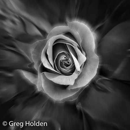
Just selecting the B&W conversion will produce a mid-tone grey image without much impact—you will need to process the image further. I will readjust exposure and contrast, often intensifying the whites and blacks to give a larger tonal range than what I would typically do for a color image.  Unlike color images, B&W images are often more effective when you have some areas of the image that are pure black without shadow detail and other areas that are nearly pure white with minimal highlight detail.
While Lightroom is great for many of my B&W conversions, when I really need to work the texture or the tonal range of an image, I will export the file into Nik Software’s Silver Efex Pro (SEP) plug-in because it provides a lot more dedicated tools for B&W post-processing. SEP allows me to easily emphasize texture with multiple structure sliders and create rich tonal range with exposure sliders for high, mid and low tones. I will often use some of the built in presets as starting points for my conversions. Some of my favorites are Antique Plate 1 (sepia tone), high structure (great for texture images of trees or rusty cars) or low-key (great for a fresh look on plants or a spooky feel for abandoned locations).
So whether you prefer a more natural B&W conversion or the higher contrast images, producing B&W photos will really show off your creative and artistic side.