Brightness and Visual Weight
October 13, 2020 by Admin
By Roy Sewall
I say there should be no rules in photography but we should be aware of human nature - how people are likely to react.
We can observe that viewers' visceral reactions to photographs are driven by the subject, light, composition, and color (or black-and-white tones). I believe that all four of these "attractors" have to be in good condition to make a great photograph; we've observed that if any of them are lacking viewers will be less pleased with the photograph. However, even if they are all in good condition, there are over 60 "detractors" that can ruin a photo. Awareness of these issues is very helpful for creating successful photographs.
One of the most prevalent detractors I see in work by less experienced photographers is bright white or near white skies with no detail. When you look under the covers to figure out why this is a problem, you find that bright areas, like white skies, create a lot of "visual weight," meaning that the viewer cannot help but go look there. But when the viewer's eyes get there, there is nothing to see. It's totally counterproductive, as it takes the viewer away from what you want them to look at.
Take a look at the sample photograph below. While in Ireland in 2015, I stumbled onto a wedding photo session in progress on a country road. I snapped a few quick shots for fun but didn't want to interfere with the official photographers.
Do you notice how much the white sky in the upper left corner is a distraction that pulls the eye away from the couple, who are the point of the photograph? Even the little white triangle over their heads is distracting. These bright white areas have way too much visual weight.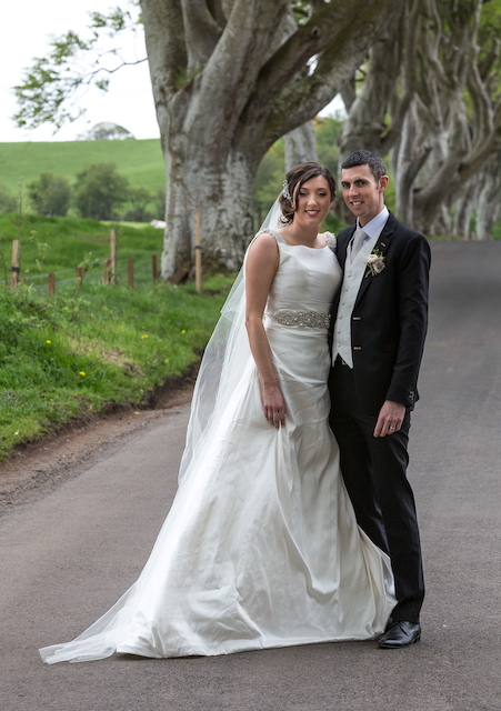
My own solution to this is to avoid white skies in all serious photographs. They never help a photo, and if you work the scene hard enough you can get white skies out of the frame. (I don't worry about them in casual snapshots or record shots.)
As artists we need to direct the viewer's eyes to where we want them to look. Part of this process is to manage the visual weights of the various objects and areas. I call these objects and areas "elements," as in compositional elements. In the photo above, the elements are the people, the road, the trees, the bushes way in the back, the sky - all the things in the scene. (Note that the word "elements" can have other definitions by other photographers.) So in analyzing a photograph I will identify elements with inappropriate visual weights that are creating a distraction, or conversely, not enough emphasis.
I'm aware of six contributors to an element's visual weight: size, position in the frame, brightness (white skies are an example), sharpness, contrast, and warm colors.
This is the kind of discussion that Roy has during his critique groups and the “Take Your Photography to the Next Level course.” Learn more about how you can work with the Attractor elements and avoid the Detractor elements in your photos.